
This semester I took an NYU Tandon class called Print and Code which involved a lot of... printing and coding. I was interested in the class because I wanted to gain more experience working with risograph printers and paper as a medium. I've dabbled in zine-making through my own experimentation at Meta's Analog Research Lab and Seattle's Paper Press Punch but still struggled with preparing my hand-drawn or collage zines into print-ready digital files.
A risograph printer is a unique type of printer that works like a mix between a photocopier and screenprinter. Risographs are known for their vibrant colors, slightly imperfect textures, and eco-friendly operation.
 [Example of two risograph printers surrounded by colorful riso prints (source: Culture Flock)]
They work by converting black and white digital files into physical stencils, and these stencils allow varying amounts of a single color of ink to pass through onto a sheet of paper. These black and white files, called "contact sheets", are what I've struggled with in the past, because they require you to reduce a multicolored file into (typically) two ink colors; one file for each ink color. The inks can overlap to produce a wide range of colors, which has been difficult for me to visualize when working in separate contact sheet files.
 [Animation of how the riso stencil imparts ink onto paper (source: Risotto)]
This class helped me understand the processes needed to prepare files for risograph printing, and also gave me my first hands-on experience with the Axidraw plotter that I hope to use for my thesis next semester. Here's some prints that I produced this semester in Print and Code.
1. Risograph Animation
The brief for this assignment was to create a digital animation from risograph printed animation frames. For my source media I chose a goopy animation I made of a Ringpop with Womp3D. Here's the original video
 [Experimenting with the "goopiness" parameter in Womp3D]
I converted this video to a sequence of still image frames, and handpicked a subset of frames that showed a clean looping animation, progressing from low goop (very jagged and sharp edges) to high goop (smooth surface) and back to low goop again. Photoshop has a convenient function (File > Automate > Contact Sheet II) to load these frames into a grid layout, perfect for generating a contact sheet for riso. Having them in one file means that the printer can print them on a single sheet of paper.
 [The animation frames laid out in a grid in Photoshop]
Next I handled color separation. Because this file exists on a screen, it uses RGB color pixels to render the image. On paper it's no longer screen-based, but rendered with ink. Ink, like common printer ink, doesn't use the RGB color space but rather CMYK: cyan, magenta, yellow, key (black). So I converted my Photoshop file to the CMYK color space and was able to view each channel individually. For example, this is the magenta channel for my Ringpop frames. Black means there's full magenta saturation, and white means no magenta. There was a lot of red/pink/purple in my original video, which all have some magenta in them, so this output makes sense.
 [The magenta pixels present in my Ringpop animation frame file]
That's pretty close to what the riso needs for the black and white contact sheets... I chose to combine the magenta and black channels together into one contact sheet to print with fluorescent pink ink as the primary color. Then I combined the cyan and yellow channels into another contact sheet to be printed with yellow ink as the secondary color of my print. I arrived at this combination of channels and ink colors by experimenting with the possible outputs through this p5 code.
[The p5 code and risograph preview]
Finally I printed the file on the risograph and scanned the file back to a digital form to work on the animation. I grabbed each animation cell and compiled them into a frame sequence, with all of the charming risograph imperfections baked in. At first I was skeptical of the digital --> physical --> digital workflow, but the step of physically printing the animation frames added a layer of glitch and entropy into the animation that is hard to get from a computer. The frames themselves are a cool piece of art!
 [Final Ringpop risograph animation]
 [Ringpop animation frames printed on risograph with yellow + fluorescent pink ink]
2. Generative Design
The goal of this project was to code a generative design system, and then print it. I'm in the middle of a Star Trek: The Next Generation rewatch, which was the inspiration for my orbit generation algorithm. I wrote a function that generates a single orbit configuration with several parameters randomly calculated
- Diameter of the center body
- Number of elliptical orbit paths (0-3)
- Length of elliptical orbit major/minor axes
- X/Y offset of elliptical orbit center
- Number of planets in each orbit path (1-4)
- Diameter of each orbiting planet
- Presence of ring around orbiting planets
The math hurt my brain but these parameters introduced enough variation into each random orbit that I was able to generate a grid of many orbits that are visually distinct from each other.
 [A grid of randomly generated orbits]
I purposefully worked with a gradient of 2 colors so that I could easily transfer this design to risograph. Working with the p5.riso library (see previous post) is so straightforward that most of the setup is these 2 lines of code
layer1 = new Riso("BLUE");
layer2 = new Riso("FLUORESCENTORANGE");
Anything drawn to layer1 will appear on the blue contact sheet file, and anything drawn to layer2 will appear on the fluorescent orange file. I wrote this helper function to make color separation easy -- anytime I need a color in my code I call this function and it returns a random combination of 2 grayscale values. One for the blue contact sheet and one for the orange.
let getRandomColor = () => [random(0,256), random(0,256)];
Here's all of the code
[The algorithm used to generate random orbits and the risograph preview]
During printing I had a hard time with the blue ink drum so I switched to green. The results still look pretty good.

3. Machine Drawing
This project was an introduction to the Axidraw plotter, which I previously described here. For the sake of having a design to plot, I worked with multicolored Truchet tiles. These are a well-known repeating pattern in the generative design world.
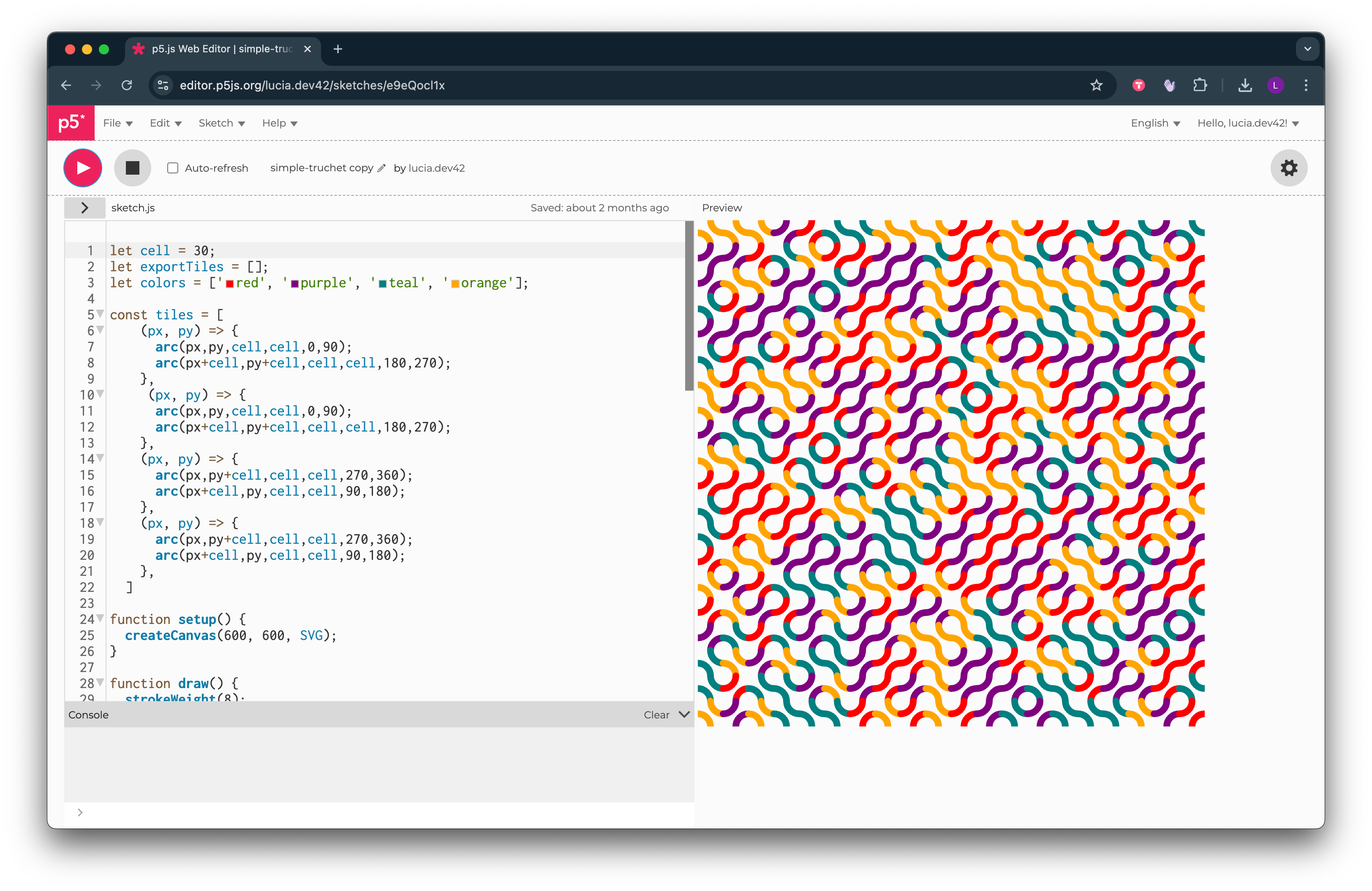 [My code to generate a series of Truchet tiles in 4 colors]
I wasn't interested in coding a unique design, but rather testing the limits of the Axidraw by using multiple pen colors. I had to prepare my files in a way that was compatible with how the Axidraw works. It can't be paused, so you can't switch pen colors in the middle of drawing a design. As a workaround I exported 4 separate files from my p5 sketch, 1 file for each color. This meant I could insert one pen color, let the Axidraw do its thing, and then swap out the pen color before running the next file.
This worked, but the Axidraw requires very precise alignment between the paper and the plotter head that holds the pen. Switching out pens was tricky and it took me a few attempts to get good alignment between colors. There was also some issue with the Axidraw's calibration where it started off at the top with perfect alignment, but by the time it plotted the bottom rows it was very misaligned.
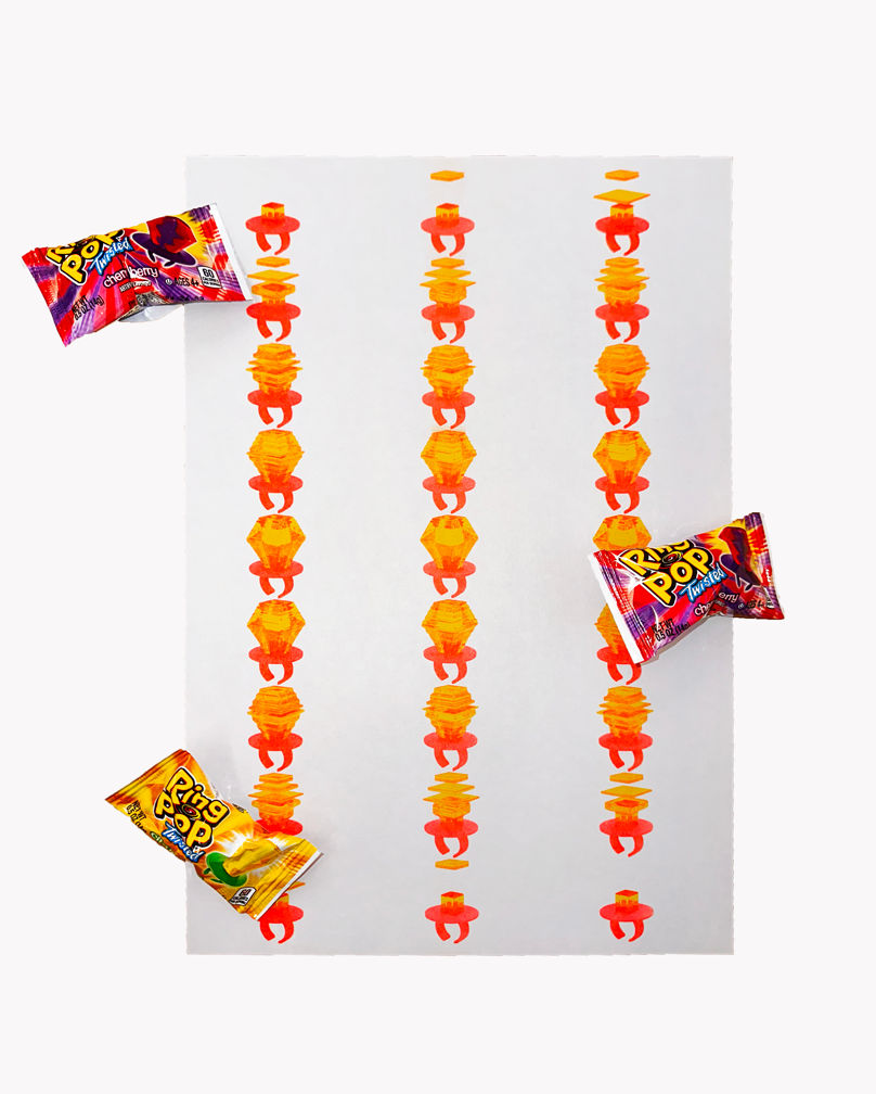
 [Multicolored Truchet tile output on the Axidraw plotter]
I'm excited to dive deeper into plotters next semester, especially after we had a guest lecture from plotter artist Licia He! Her website is the holy grail of plotting with paintbrushes, as a contrast to more typical and predictable writing implements like pens.
4. Tech Zine
I collaborated with my classmate Myrah Sarwar to create an experimental tech-themed zine, although I'm not sure if you can really call it a zine. Our project Guess Whose Data? takes the form of a Guess Who game board. In a game of Guess Who, players guess a character's identity by asking their opponent questions about their physically identifiable traits. Myrah and I wanted to riff on this format by wondering how we could identify someone based on their digital footprint.
 [The backs of our two Guess Whose Data? boards]
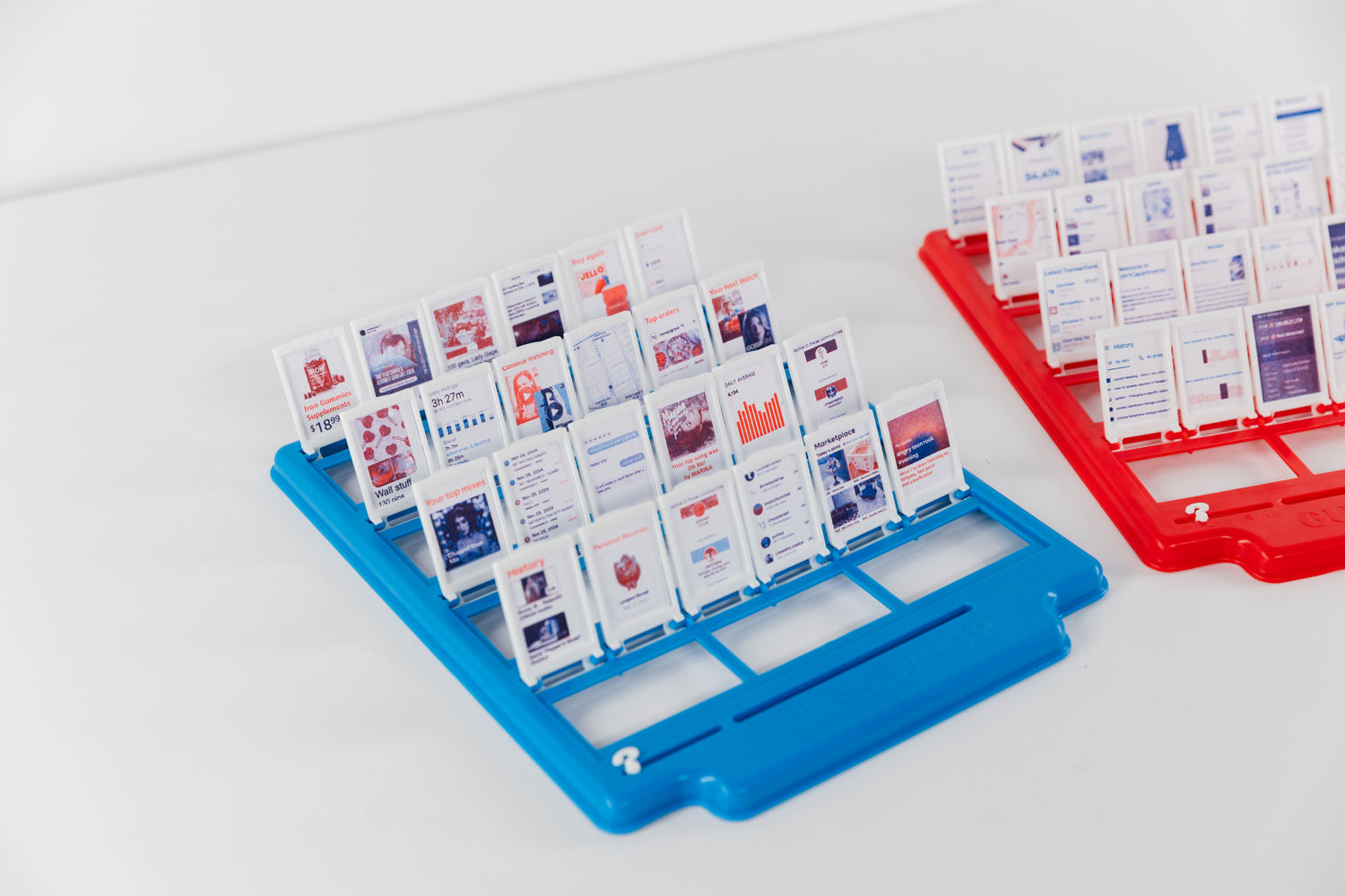
Guess Whose Data? isn't exactly a game, but rather a playful data visualization to display how Myrah and I explored our identities as seen by online data. Companies store all kinds of data on us, and they and their algorithms only see us as the sum of our data. To build our personal datasets, we went through our phones and took screenshots of data that paints a picture of who we are. Browser history, Spotify suggestions, Instagram ads, etc. I prepared my screenshots to fit on the tiny Guess Who cards of one board, and Myrah's cards filled the other board. We wondered if our classmates could guess whose board belongs to who based on our data.
 [Some of the data cards in Guess Whose Data?]
They could! The blue board is mine, and the red board is Myrah's. Even classmates who didn't know us that well were able to deduce who was who based on clothing ads, TV show preferences, and subreddits that we're a part of. My board did reveal that I recently purchased Jello on Amazon, so that was a dead giveaway for people who have seen my series of Jello projects.
 [Both of our Guess Whose Data? boards]
File preparation for riso printing was fairly straightforward. Our main concern was making the text legible on such a small surface area. The Guess Who cards are about 1" x 1.5". We had to manipulate the screenshots in Photoshop to scale up the text. I also erased any unnecessary details from the screenshots to avoid noise on the already small cards. We wanted contrasting color palettes between the riso ink and the plastic Guess Who boards. Since my board was blue, I tried to lean into a red color palette for my prints. I combined the magenta + black channels to print as red, and the cyan + yellow channels to print as blue.
 [My card layout in Photoshop. I prepared contact sheets based on this file]
 |
 |
 |